By Jo Nova
Brave scientists at the CSIRO and BoM have dug hard through the sacred Arc of the Climate Covenant, CMIP-6, to discover the horrible truth that we only have seven years (just seven!) until we pass through the sanctified Target-of-Paris on Halloween of 2031.
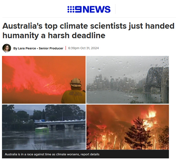
Channel Nine shares this “harsh deadline for humanity” and tells us the chance to limit global warming to the Paris Agreement goal of 1.5 degrees “will expire” then, like 2 for 1 sale coupon. They don’t quite explain what happens on November 1st, 2031 — but most people will assume it’s just like what happened after Prince Charles and Al Gore and the UN said we only had ten years to go (which was nothing).
But the horror show continues, not in our climate, but in our science: where the work of past scientists is deleted, and dubious datasets get adjusted with secret algorithms and thermometers near incinerators and over hot bitumen carparks that may be 1,000 kilometers away. The CSIRO-BOM Blob have massaged Australia’s temperature record so it can fit their favourite climate model. Dishonestly, both institutions hide the heat of the Federation Drought, where places all across Australia recorded temperatures over 50 degrees in 1896. BoM and CSIRO delete the cooling trend their own experts recorded from 1900 to 1950 in Australia. (Deacon et al).
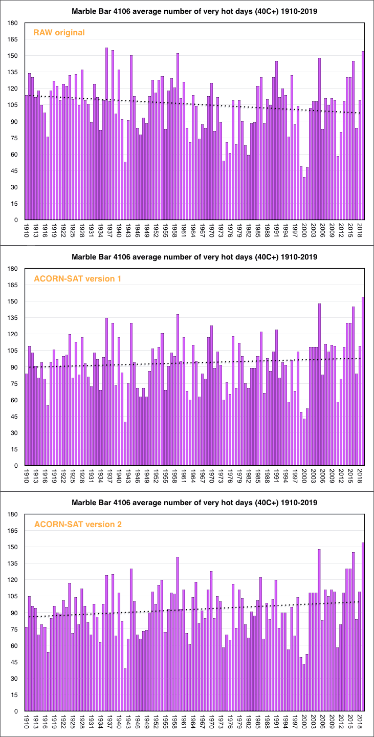
The BOM and CSIRO pretend the temperatures are accurate in the graph above. They don’t tell Australians that they keep adjusting the data, even a hundred years after it happened. Some poor towns didn’t know they were two degrees colder in World War I until the BoM “discovered” that in 2014. The people of Marble Bar thought they had the hottest heatwave in world history in 1923 until the BOM traveled back in time to delete it, I mean “correct it”. Temperatures in 1910 have fallen 22 degrees Fahrenheit in the last 10 years.
At the current rate of decline, the 1920 miners of Marble Bar will be in an ice age by the end of the century.
The irony is that the BOM ignore the hot temperatures of the 1800’s because they were not in standardized modern Stevenson screens, yet the BOM is happy to take those lauded Stevenson screen measurements from 1920 and drop them in a high speed homogenization-blender to adjust them by as much as 2 degrees.
So the BOM can “adjust” the data to get any trend they want. Then there’s the added heat of a million tons of concrete and brick keeping our cities warm. And on top of that scientific hamburger, thermometers boxes shrank from 230 litres to 60 litres, and glass instruments became electronic ones. They don’t mention that their super accurate new gizmos can pick up brief changes in temperature that the old glass ones can’t. And possibly they can pick up the airport radars too.
Maximum record temperatures may be a one-second-record, literally there and gone in a moment, and if it was radar interference, not even there at all.
When asked, the BOM say they have calibrated and tested the different thermometers side by side, to show they are comparable, but they won’t release the data. As if the thermometer readings at Canberra airport are a national security issue.
They also don’t mention that scientists in Australia were reporting that Australia was cooling from the 1890s to 1952. (Deacon et al) The ghastly heat of 1896, the Federation Drought, and the 50C record temperatures all over Australia all go down the memory hole.
Lest we forget, those historic heatwaves.
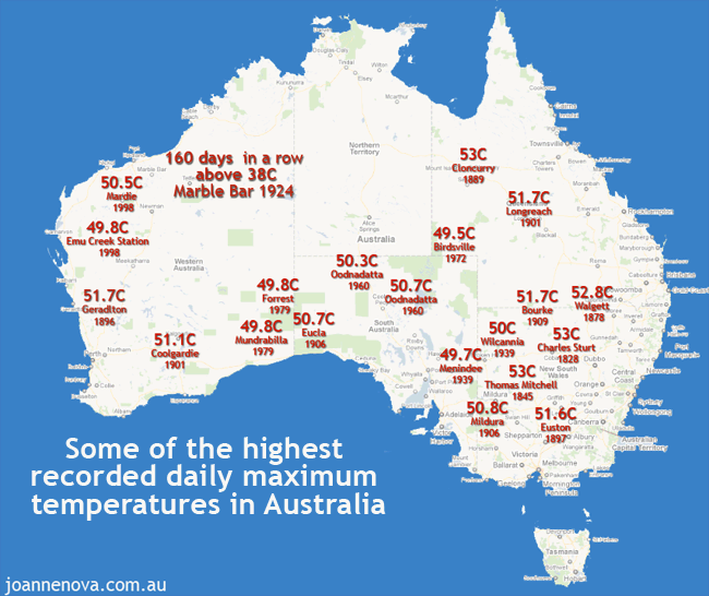
Historic heatwaves. 50 degree temperatures were everywhere, right across Australia in the 1800s and 1900s.|
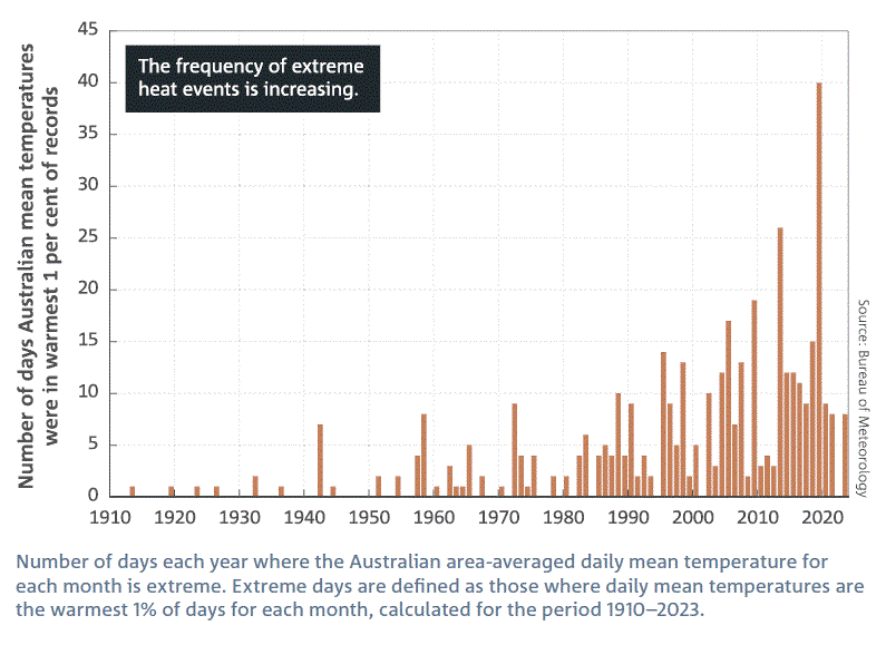
Not surprisingly, after we adjust all the records, we find extreme heat events are increasing
And this is the shocking graph the BOM-CSIRO blob gave us in 2024:
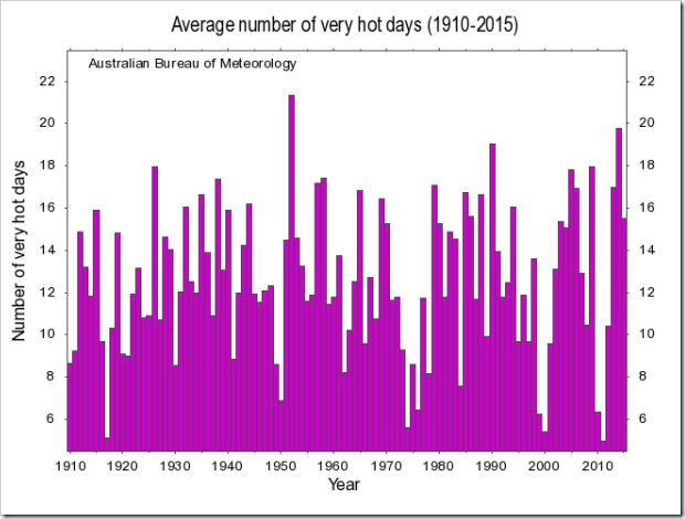
But ten years ago the BOM showed Australians a different graph, one which looked like this, til they took it off their own website. And there is bound to be some excuse to justify it. A different permutation or combination of variables, an older dataset, some plausible deniability.
But the fact remains, that the BOM-CSIRO-blob are not trying to give Australians the whole truth and nothing but the truth:
Reading the tea-leaves on rain in Australia
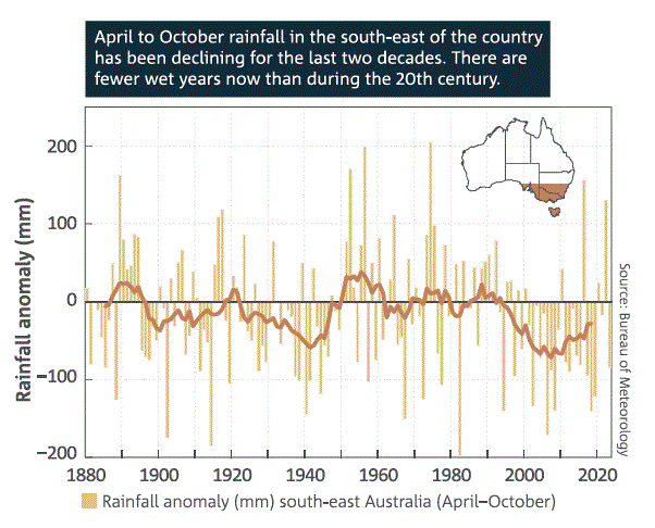
By selecting some contrived permutation the BOM-CSIRO-Blob can create the illusion that something unusual is happening. Here, they show the April to October rainfall in one particular part of the country as if this has some special meaning. (Their climate models fail on rainfall trends nearly universally). The Blob can cherry pick permutations until they find something. But here, even the best trend they can get doesn’t resemble our CO2 emissions. Why was the winter rain almost as low in 1940? The BOM don’t know. They could make up some reason post hoc, but they can’t predict it.
If the BOM-CSIRO-blob wanted, they could show Sydney-siders the total rainfall record for the last 130 years. But they can’t because it would be obvious to everyone that it has nothing to do with CO2. It could just be noise in the system, oceanic oscillation, or cycles controlled by the sun.
This (below) was the total rainfall in Sydney from 1840 to 2019, and the total number of rainy days, the peak amount of rain that falls in a single day and the intensity of the downpours. Why isn’t it in the State of the Climate? Why haven’t the BOM updated this graph? (From the Ashcroft paper of 2019).
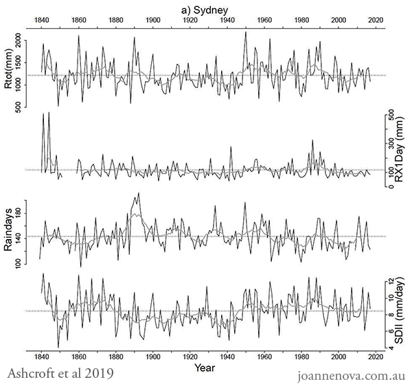
Rainfall trends, cycles, Australia, Sydney, Graph, 2019, 1840 – 2020..| Abbreviations: Rainday counts (RD), monthly rainfall totals (Rtot), and highest daily rainfall (Rx1day). The Simple Daily Intensity Index (SDII): the amount of rainfall received divided by the number of raindays recorded over a month and year.
The exact same pattern is visible, by the way, in rainfall records from Melbourne and Adelaide too. But almost no one in Australia would know that. The ignorance isn’t an accident.
Thank the BOM. Thank the CSIRO. Thank the ABC.
REFERENCES
LindenAshcroftabDavid J.KarolyacAndrew J.Dowdyb(2019) Historical extreme rainfall events in southeastern Australia, Weather and Climate Extremes Available online 10 May 2019, 100210
Deacon, E.L. (1952) Climatic Change in Australia since 1880, Australian Journal of Physics, Volume 6, Pages 209-218. [PDF]
State of The Climate 2024 can be found on the CSIRO and Bureau of Meteorology websites.
State of the Climate 2022, Bureau of Meteorology
State of the Climate 2022, CSIRO
State of the Climate Report CSIRO 2014. CSIRO
Previous State of the Climate Reports, CSIRO
And even more droughts and trends graphs here.
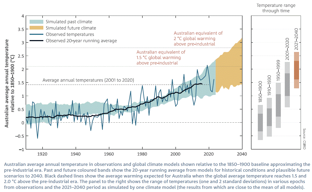


WHY did they start at 1910/1920?
One would think that the start point is significant if you’re predicting the end of the world
Cheers,
340
I believe this date was chosen because the BOM claimed that not all temp measurement sites had the correct setup. But as Jo and others have pointed out, many sites did have the standard setup well before this date, so surely their readings should be included.
190
And “homogenised”, using the current methodology.
60
The BoM commenced operation on 1 Jan 1908.
We can be assured though, that if 1896 was cold, they would have found a way to use that data.
250
Around 1910 it was particularly cold. That makes it a really good starting point. For cherries.
250
Late 1800s to early 1900s severe heatwaves recorded, example Bourke NSW Post Office weather station records that BoM ignore.
1895 Federation Drought
170
Federation Drought 1895 to 1902
100
Plus Popeye, on the sidebar of the first graph from BOM and CSIRO, why were the two unusually hot periods 1900-1910, and 1930-1950 excluded. They are putting their finger on the scale.
40
They can fudge temperature but not precipitation.
‘We identify several extreme daily rainfall events in the pre-1900 period in Sydney and Melbourne that warrant further examination as they appear to be more extreme than anything in the modern record.’ (Ashcroft et al)
262
I see a report that 491 mm of rain was recorded in eight hours in Spain causing awful flooding. That is nearly 20 inches.
I recall that in the 1955 flooding event in the western reaches of the Hunter Valley we didn’t go to school because Dad said we wouldn’t get back. It kept raining and we had eight inches in eight hours, and 13.5 inches in 24 hours. Cassilis with more elevation measured 17.5 inches.
The resulting flood in the Goulburn River (NSW) was comparable with the 1893 flood, but never since 1955 has there been an event to come anywhere near that intensity. The next biggest registration that I recall was 5 inches in 24 hours. That event was unusual in that it rained steadily, but not heavily, for the 24 hours, and everybody got the 5 inches, whereas usually rainfall was higher on the higher country.
I can’t recall the date, but there was big flooding in Sydney and Wollongong, which put cars on top of cars in Rose Bay and did so much damage in Wollongong that it finished up changing the insurance system. That event was at the time without precedent, and shocked authorities into making new studies of the integrity of the dam spillways in the catchment. I think Warragamba’s was enlarged.
No precedent then. But we have had several such rainfall events since.
121
And the Report only reports “Doom and Gloom”. It does not cover the benefits of Global Warming” (Climate Change) such as more rain for Australia as well as greater crop yields and more trees (even though the Authorities are chopping more down for the Transmission lines and Renewable plantations).
The Greens should love more green…….
300
Johnny
Re “The Greens should love more green…….”
Not if it was useful they wouldn’t!
130
The Greens DO love more green….but it’s the kind that folds
100
Political science for the “win”.
Again.
The corruptocrats KNOW the the fix is in.
The media blob is a key player in this caper of opinion shaping; the core operating principle of The Filth Estate.. The association of “Climate change” with every natural disaster, viz, this week in Spain seems to be core doctrine…
The clear intent is to change society to a new image in which the [corrupt freeloaders] will be in charge of everything, including total micro-management of diet, housing, transport; basically an “open” concentration camp. They mean business, starting by shutting down those of lesser people, you know, the ones some old Austrian postcard painter called Untermenschen.
[Please check your email. – Jo]
60
All of the Climate Alarmist predictions have yet to eventuate. Now the goal posts have moved once again. Another 7 years to go until they are proved wrong Big Time once again.
280
Punch line from a cartoon –
“Believe it or not
There have been 41 climate disaster predictions since 1967.
Their record so far?
0 – 41”
180
I have around 150 listed, all of which failed to materialise.
80
0-150!
Thanks Graeme4!
Auto –
30
Their predictions are so bad they have all got “Gang Green” so are rotten to the core!
00
I still love this 6 month average temp record from the summer of 1910-1911 that I think Strop posted a while back , last I looked it was still on Bom’s site .
http://www.bom.gov.au/jsp/awap/temp/archive.jsp?colour=colour&map=meanave&year=1911&month=2&period=6month&area=nat
80
If you look at that hot days graph, the latest version, it seems extreme since 2010, a rapid increase. So you would expect people on the street to be talking about it, how hot it is now. But you don’t. No one complains of the hot summers we get now. No one. In fact since 2019 the summers have been very mild. Notably so. The original version seems to portray what I’ve felt.
Furthermore, this rapid increase in heat, what effect has this had? I live in the same forest I did in the 1970’s and it is EXACTLY the same. More pythons and wildlife than there used to be, but that’s about it, the plants are identical. So even if the graph shows a rapid increase and let us pretend it is legit, it makes zero difference to anything.
It’s all smoke and mirrors. Clearly.
321
Well done Jo, an all time classic piece summarizing the malfeance/incompetence of the CSIRO:BOM. Or as you more eloquently describe them – the “ blob”. To make the article more perfect, there’s an unneeded “ to” in paragraph 9.
[Thanks. Fixed. – Jo]
250
And, “fewer wet years than in the 20th century”. Interesting. We own a swamp at the back of a floodplain, and usually when it gets dry we mow it for low land grazing. Haven’t been able to get into it for the last 4 years, it just won’t dry out before a big downpour comes. Annoys me because I like mowing that swamp.
But I guess you make these conclusions when you’re a 25 year old “scientist” who lives in a lab. (Did anyone see the picture of the CEO of the “climate Council”?) Go outside, get away from the computer, the ecosystem is doing just fine. In fact very good. This year has been the most ideal season for farming, you can’t get better.
300
Philip, it might have been the most ideal season in your area, but for others (eg graingrowers in SA, Nth Vic) it’s been a relatively dry winter/spring. Plus, a lot of crops frosted. No joy there. But is it a sign of the dreaded “CC”? No, those areas have just come off a number of very good years.
190
7 years?!
What happened to 5?
This can only be attributed to End of the World Catastrophe inflation.
It used to take only 1,825 days to get to catastrophe.
Now it takes 2,555 days.
I blame Trump.
360
97% of burro-crats blame a trace gas, as well as Orange Man Bad . . . .
Auto
50
I suspect you are referring to this article which was the point where there was a 50/50 chance that the 1.5°C carbon budget has been exceeded. https://theconversation.com/carbon-budget-for-1-5-c-will-run-out-in-six-years-at-current-emissions-levels-new-research-216459
Debating how much Australia has warmed is not relevant, the question is how much global warming has occurred since pre-industrial times. You can debate the homogenisation methodologies used by BoM if you want, but I doubt that anyone here has the statistical nous to put up a genuine case. The BoM estimates align well with the other temperature reconstructions, e.g. Berkley Earth https://berkeleyearth.org/temperature-region/australia
013
Does anybody know why there are two rainfall gauges in Mitcham (Melbourne). One is 586006 and the other is 86074. They appear to be located on the same site, or at least in the same vicinity as they are both on the same Dot on the BOM weather chart (top and bottom). One is named Mitcham Reservoir, and the other is Mitcham. On regular occasions they record massively different totals ie: on the 19/10/24, 586006 recorded 5.2mm and 86074 recorded 22mm. I have taken photos of the charts at various times to show people but no one seems to know. I live near this area, and I vouch for 86074.
100
I would not get worried about a difference of 15mm in a downpour. Rain can be fickle particularly around Melbourne.
The rain in Spain this week managed a massive 490mm in 8 hours at Chiva. I expect there were plenty of gauges in close proximity that had differences of 15mm or more over a day.
I know how convective instability works to create rain. The rain depression that created the Chiva flooding developed over Morocco and fed off CAPE in the Med east of Spain. It was a rain depression not a cyclone and typical of lows that develop over land but do not intensify to cyclones. https://earth.nullschool.net/#2024/10/29/2300Z/wind/surface/level/overlay=cape/orthographic=-8.09,34.57,1272/loc=1.559,38.971
We are starting to see these depressions forming over land in the Northern Territory as well following drenching rain similar to what Morocco experienced this year Water begets water.
The Mediterranean is reaching the magic 30C surface temperature limit where the atmosphere goes into overdrive to prevent further rise in temperature. All the land surrounding the Med will experience increased monsoon. The Med is now reaching up to 3C warmer than the late 20th century average. Bodes well for rainfall over the Sahara. And will be a continuing trend for the next 9000 years.. A reversal of the drying trend for the past 5000 years.
90
Camels will have to learn (or remember) how to swim again. Thank goodness, it’ll be a much smoother ride – have only ridden a camel once (in the Sinai) and never again shall my antipodean buttocks astride a wild ship of the desert.
Bedouin Swimming Camel Tours 2030 anyone?
90
When the “predicted climate warming” occurs then camels will migrate to the south of NZ.
With your previous experience you might make a fortune winning the camel races.
O/T but there used to be a camel farm south of Adelaide in McLaren Vale wine region.
A number of imbibers used to hire camels to go from winery to winery – avoiding police breathalysers etc.
The business failed due to injuries – imbibers fell off said camels (and it is a long way down.
90
In Perth, the rain is often so granular that different gauges across the city record quite different things. I would think it makes more sense to average rainfall over at least 5 or maybe 10 gauges to more accurately reflect what’s happening.
120
In all the discussions about rainfall and flooding the is seldom if ever any mention of the relationship between the depth of rain, ie millimetres, and the volume of water that falls. In other words, 1 mm of rain in a rain gauge is not much at all. However, if 1 mm of water falls on a square metre of ground, there is 1,000,000 cubic millimetres or 1 litre of water. Obviously the volume of water increases with greater depth and area. And averaging the rainfall over a number of rain gauges in a defined area would provide some idea of the volume of water and the risk of flooding
00
The camel farm is still there
10
Gauge 586006 is a Melbourne Water gauge and not a BOM gauge. That might be why there are two in that proximity.
Here’s the Melbourne Water link to the gauge.
https://www.melbournewater.com.au/water-and-environment/water-management/rainfall-and-river-levels#/reader/586006
You can view all Melbourne Water’s gauges in the greater metro area via the map in that link. View any blue dot in the map and the number in it is the rain recorded since 9am. Click on the blue dot to get data options.
Yellow dots are stream flows in the various rivers and creeks at that depth gauge.
Why is there such a difference over a short distance? Sometimes that’s just how rainfall is.
You’ll see notable differences from one suburb to other across these blue dots.
I used to live 4km from one of a Melbourne Water “blue dot” gauges and typically had similar recordings in our own gauge. Then would sometimes get big differences in the heavier short duration events.
80
Rainfall where I live can be highly variable and localised , so much so I was talking to the neighbour over the fence he was getting rained on and I wasn’t just a few metres away .
40
I recall being taught at school that rain gauges had a margin of error of about 20%.
I can’t substantiate it, but it never struck me as a particularly odd bit of info. if you want to measure it, you have to capture it, and rain doesn’t always fall vertically, etc…
mind you this was 30 years ago, maybe they have improved things since.
40
Thanks again to Jo Nova for clearly stating the facts.
Again we live in the safest world in Human history and yet we hear so much today about the terrible floods in Spain.
The loss of life is very sad but deaths from floods and droughts since 1960 are very low today and yet we’ve increased global population by over 5 billion over the last 64 years.
Use your mouse to highlight deaths since 1900 from all decadal disasters at OWI Data link. Deaths are per 100,000 people.
https://ourworldindata.org/grapher/decadal-average-death-rates-from-natural-disasters
100
The saddest fact is that reducing carbon combustion across the globe would not have altered the flooding in Spain. So be prepared for more to come.
The conditions for increased flooding in Spain started around 500 years ago when the peak sunlight started to move northward again. We can observe the rapid rise in temperature in the Med; reaching the 30C limit in late summer. We are beginning to see flooding monsoon across Northern Africa. The low that caused the rain in Spain developed over Morocco and fed off CAPE over the Med. You would likely need to go back at least 1000 years to see similar conditions because the NH experienced its lowest peak sunlight 500 years ago.
No amount of penance for burning carbon is going to alter this entirely natural climate change. The only way to avoid the devastating consequence is better engineering of the built environment. Choose wisely where you set up home.
100
Lomborg has recently written about deaths from extreme weather events and here’s a quote from one of his artcles in the Daily Telegraph.
“Yet the impression this barrage of catastrophe gives is wildly misleading. It makes it harder to get climate change policy right. Data show climate-related events like floods, droughts, storms and wildfires aren’t killing more people. Deaths have dropped precipitously. Over the past decade, climate-related disasters have killed 98% fewer people than a century ago”.
“This should not be surprising because the trend has been evident for many decades, although it rarely gets reported. A century ago, in the 1920s, the average death-toll from weather disasters was 485,000 annually. In 1921, the New York Herald headlined its full-page coverage of droughts and famines across Europe with “Deaths for Millions in 1921’s Record Heat Wave.” Since then, almost every decade has seen fewer deaths, with 168,000 average dead yearly in the 1960s and fewer than 9,000 dead each year in the most recent decade, 2014-23”.
100
Does Whim Creek in Western Australia still hold the record for the most rainfall in 24 hours in Australia ?
50
Dutton as PM needs to commence [an independent audit and investigation] of BOM executives and staff over this.
They must be punished for confecting and publishing lies which harm Australia in so many ways.
Public servants are not allowed to create deliberate lies.
[SNIP]
271
We demand an audit, then we can see how they have manipulated data to get a warming trend. Not sure if Dutton has the bottle to take on the scientific (sic) high priests, it depends on what Trump does.
132
My goodness Peter Dutton is going to be busy – provided he does get in of course. An audit of BoM. An audit of the ABC. An investigation into climate models and the IPCC (I don’t think there’s any law in Australia that prevents the latter). An audit of the electricity grid and its suppliers. A complete change to grid operation, including making all suppliers compete on a level playing field (the greens will be particularly supportive of that, because renewables are now so cheap that if the constraints are removed they can completely wipe out the competition). And masses more no doubt.
80
All needed, without doubt.
Same in the UK – a lot of auditing, and responsibilities, all needed.
But we’ve only just [July] had an election, where the – nominally pro-freedom, pro-business, pro-wealth-creation – Tories got pretty much wiped out – 121 seats out of IIRC, 650.
But – votes have consequences.
The budget on Wednesday has committed the UK tax payer to paying huge amounts more in interest [more borrowing, and higher interest rates! Bad combination!].
All the borrowed money seems set to go to union hobbledehoys [mostly in sunset industries and government ‘service’] in higher wages – and there is a veiled suggestion that efficiency measures may, perhaps, be considered . . .
Private sector – we don’t need no steenkin’ private sector!
Auto – discouraged – if not one whit surprised. The UK voted for Socialists!
Will they ever learn?
At least, many voted to get shot of the useless Tories, – leaping BEFORE looking!
20
Dutton doesn’t have the bottle at the moment due to the left in the Libs not taking kindly to anything
questioning the climate consensus. But the One Nation people have been asking those kinds of questions for years through Senator Malcolm Roberts- see his 2015-16 reports on the CSIRO and BoM. He found that the CSIRO just took the IPCC’s data on AGW as gospel not questioning it or the local context making a proper analysis of Australian climate history or present trends. These agencies are culpable of deceit, lies- obscuring data, falisification of data through homogenization and improper adjustments for UHIE. All in support of the dangerous AGW climate narrative, that science has already proved is invalid, but the academics, bureaucrats and politicians aren’t listening because their heads are firmly in the funding trough!
Science has invalidated measurable current or future CO2 warming compared to water vapour/cloud activity due to IR saturation effects, and because human emissions are only 4% of the total rising biosphere CO2 output we cannot have AGW, certainly not catastrophic behavior as predicted by the IPCC climate alarmists and eco-freaks.
Therefore, the whole basis for climate alarmism is false and Net Zero is totally unnecessary, a warmer climate is good for humanity and increased CO2 is great for the environment, for our crop development and greening of our planet. So, what is the real problem here? It’s all down to the new left enviro-politics and the media, not science. They are prostituting science to achieve global socialist goals, by scaring the world into giving them more power, that they can’t get by normal democratic voting means, who else but the unelected UN and EU bureaucrats are running this climate fear campaign aided and abetted by the well-funded environmental lobby.
Shame on all of them, that their solution to the climate problems- Net Zero is going to cost us poor sods 78$ trillion by 2050, but all it will do is ruin productive economies and not change the climate one whit!
10
Again here’s Australia’s rainfall since 1900 and check out the improved rainfall trend from 1949 to 2023.
http://www.bom.gov.au/cgi-bin/climate/change/timeseries.cgi?graph=rranom&area=aus&season=0112&ave_yr=7&ave_period=6190
90
The great climate shift of the 1970s was not caused by rising CO2. My first instinct is to look at natural variability for the increase in precipitation.
‘The shift in climate regimes around 1970s caused an overall enhancement of precipitation extremes across the globe with a specific spatial distribution pattern.
‘We used gridded observational-reanalysis precipitation dataset and two important extreme precipitation measures, namely Annual Maximum Daily Precipitation (AMDP) and Probable Maximum Precipitation (PMP).
‘AMDP is reported to increase for almost two-third of the global land area. The variability of AMDP is found to increase more than its mean that eventually results in increased PMP almost worldwide, less near equator and maximum around mid-latitudes. Continent-wise, such increase in AMDP and PMP is true for all continents except some parts of Africa.’ (Sarkar & Maity 2021)
72
The Pacific Decadal Oscillation looms large.
‘The 1976 Pacific climate shift is examined, and its manifestations and significance in Alaskan climatology during the last half-century are demonstrated. The Pacific Decadal Oscillation index shifted in 1976 from dominantly negative values for the 25-yr time period 1951–75 to dominantly positive values for the period 1977–2001.’ (AMS)
81
The climate change soap opera continues with the usual cast staying on script . Occasionally they change the cast , but almost no one leaves . The truth doesn’t get in the way of the story and if it did it would be labelled “misinformation” and memory holed . The list of failed predictions keeps growing but the media ignores it . Welcome to the mendaciumacene age .
110
If bulldust was music BOM/CSIRO a full blown symphony of sadness. Funny how this is released just as Albo & Co are writhing on a stick of reality. It’s almost as if a distraction was required?
150
You don’t have squirrels there do you. You got every poisonous, stinging, bitey critter known to mankind, and shouting, ‘Release the fruit bats!’ doesn’t convey any sense of urgency… you need squirrels. Sorry to hear you’re gonna burn, again, or drown, or not.
50
Hot week. Big storm. Floods. Why? That’s what people have always demanded (I’m 87 so “always” means for me ‘for a very long time’). It has become so easy for “experts” to answer “climate change”.
Scientists, to my shame (I am one), joined the easy path early in the piece. It’s the lazy way. The scientists who showed the curiosity, tenacity and scepticism needed to be any good at their jobs found the statistics of extreme weather events very demanding and the analysis impossible to convey in simple terms to the whole world. It was much easier to decide that convincing the population to give up fossil fuels is the moral imperative that justifies any short cuts that may be needed.
And so it came to pass. Scientists had a new role. Scaring the population became their mission in life. And they became surprisingly good at it.
I don’t know the answer. We now have seen two quite different contemporary events where science-based exaggerations rapidly gave rise to damaging national panic — climate change and Covid. The forces at work seem to be irresistible. Perhaps the next challenge will be met more calmly. One can only hope.
200
China and India are going their own way and they are truely irresistible. Reality eventually prevails. The current Climate Emergency™ will make sceptics of the younger generation.
There is no risk globally that CO2 production will decline year on year for a long time. Even Australia is doing good in this regard with literally exporting boat loads of carbon to China, Korea, Japan, India and others so they can produce CO2.
CO2 production is strong. Those not making commitments to burning carbon are becoming less resistible and having less influence globally.
60
Rick – yes.
Worth remarking here that, taken together, China and India have a total population of some 2,870,000,000
35% of humanity in those two nations, taken together.
Source – https://www.worldometers.info/world-population/# at about 1310z/1st November 2024.
Auto
20
Again here’s Lomborg’s graph of global deaths from extreme weather events since 1920 and note much lower trend over the last 60 years.
This just proves how much safer the world is today, while population has increased by a further 5 billion people.
https://humanprogress.org/wp-content/uploads/2021/09/chart-2.jpg
80
About that latest scary deadline: Pretty safe to say we can take a raincheck on that one.
50
The BoM and CSIRO are scammers trying to support their scam. They are globalist useful idiots with very limited understanding of any science at all. Their globalist agenda is leading Australia down a deep, dark hole.
There is reliable evidence that shows Australia is warming on average. I looked at the UAH data globally for the change in summer and winter conditions. The extremes in temperature commonly occur in February and August but opposite seasons in either hemisphere:
https://i0.wp.com/wattsupwiththat.com/wp-content/uploads/2024/08/UAH_Summer_Winter-1724985960.4364.png?fit=720%2C1040&ssl=1
What UAH has observed is much warmer winters in the southern half of Australia but cooler summers. These trends are consistent with changing sunlight over Australia. The peak December sunlight at 30S has declined 4W/m^2 since it peaked 1500 years ago while the peak June sunlight has increased by 2W/m^2.
Convective potential across northern Australia today is higher than it has been since 2018. The precipitable water for Nov 1 across southern Australia lhighest since 2021..
An interesting observation in southeast Australia over the past week has been the persistence of coastal cloud. Every day over the past week has seen light cloud forming and sometimes building to local rain by midday then dissipating. I have not observed conditions like thisbefore.
120
Clicked on the “Deacon et al” and went back via the time machine. Way back to 2014. Possibly around the time I first started reading Jo’s blog. A number of contributors still here today. Well done TdeF, Richard C NZ etc, still going strong. But so many commentators no longer here. But nothing has really changed in 10 years has it? The BOM: CSIRO and media just keep ploughing on with their climate alarmist predictions. Still keep ignoring all the good data from before 1910 and still keep batting away all the criticisms of their methodology. They say the truth will out, I just wish it would hurry up.
120
Great post Jo. 10+ from me. I will share with many.
90
There is one place where the corruptors hold no sway: the weather records reported in newspapers. Perhaps Oz needs an effort to collect all those newspaper reports in your libraries and assemble a database.
BOM weather records are made with public money, hence they are public property. Corrupting those records is equivalent to destroying them. Destroying public property is a criminal offence. Prosecute these people and sent them to jail.
.
120
A project like that –
Eric Rolls did a two volume series on “The epic story of China’s centuries-old relationship with Australia”
Volume 1 “Sojourners”, Volume 2 “Citizens”.
His research methods included reading as many old time newspapers as he could get hold of and extracting reports.
(He was told that that was no way to do research but did it anyway)
It does make for dense prose.
60
It won’t be necessary to go through the old newspapers, the South East Australia project has covered a lot of ground.
‘Prolonged dry conditions were identified in various parts of the region during 1837–1843 and 1845–1852, while wet conditions were noted from 1836 to 1838, primarily in southern SEA. Anomalously cold periods were also identified in 1835–1836 and 1848–1849, in general agreement with temperature reconstructions from other regions of the Southern Hemisphere.’ (Ashcroft et al 2014)
42
Right on!
20
“A deadline, a deadline, we have another deadline!”
Sing along…
Actually the timeline is right but the event wrong.

A Recap:
1966: Oil Gone in Ten Years
1967: Dire Famine Forecast By 1975
1968: Overpopulation Will Spread Worldwide
1969: Everyone Will Disappear In a Cloud Of Blue Steam By 1989
1970: World Will Use Up All its Natural Resources by 2000
1970: Urban Citizens Will Require Gas Masks by 1985
1970: Nitrogen buildup Will Make All Land Unusable
1970: Decaying Pollution Will Kill all the Fish
1970s: Killer Bees!
1970: Ice Age By 2000
1970: America Subject to Water Rationing by 1974 and Food Rationing By 1980
1971: New Ice Age Coming By 2020 or 2030
1972: New Ice Age By 2070
1972: Oil Depleted in 20 Years
1974: Space Satellites Show New Ice Age Coming Fast
1974: Another Ice Age?
1974: Ozone Depletion a ‘Great Peril to Life
1976: Scientific Consensus Planet Cooling, Famines imminent
1977: Department of Energy Says Oil will Peak in 90s
1978: No End in Sight to 30-Year Cooling Trend
1980: Acid Rain Kills Life In Lakes
1980: Peak Oil In 2000
1988: Regional Droughts (that never happened) in 1990s
1988: Temperatures in DC Will Hit Record Highs
1988: Maldive Islands will Be Underwater by 2018 (they’re not)
1989: Rising Sea Levels will Obliterate Nations if Nothing Done by 2000
1989: New York City’s West Side Highway Underwater by 2019 (it’s not) 1996: Peak Oil in 2020
2000: Children Won’t Know what Snow Is
2002: Famine In 10 Years If We Don’t Give Up Eating Fish, Meat, and Dairy 2002: Peak Oil in 2010
2004: Britain will Be Siberia by 2024
2005: Manhattan Underwater by 2015
2006: Super Hurricanes!
2008: Arctic will Be Ice Free by 2018
2008: Climate Genius Al Gore Predicts Ice-Free Arctic by 2013
2009: Climate Genius Prince Charles Says we Have 96 Months to Save World
2009: UK Prime Minister Says 50 Days to ‘Save The Planet From Catastrophe’
2009: Climate Genius Al Gore Moves 2013 Prediction of Ice-Free Arctic to 2014
2013: Arctic Ice-Free by 2015
2014: Only 500 Days Before ‘Climate Chaos
2019: Hey Greta, we need you to convince them it’s really going to happen this time.
“Most people are not just comfortable in their ignorance but hostile to anyone who points it out.”
– Plato
160
John,
Its been a bit slow on the prediction front recently . You will notice the lack of bookies interested in making odds on these predictions . They would have lost their shirts…
60
John C:
Much of what Climate “Scientists” are merely repeats. Thus Arrhenius predicted 3℃ temperature rise by the end of the century in 1911.
The Arctic sea ice being gone in summer goes back to 1935.
The (9 banded) armadillos have been going N & S over USA depending on the prevailing prediction.
And The Climate Tipping Point (due to mankind) dates back to 1865.
50
1798 Thomas Malthus: the Irish are breeding too fast and will eat all our food!
50
The end is nigh has been a constant fascination of the human mind. It manifests in many forms. In the Bible the end is nigh, in environmentalism the end is nigh. Seems a condition we just can’t shake, quite susceptible to it. We all have one.
We’ve gone from sun worship, to enlightenment, to sun fear. The madness will probably be the end of us via bioengineering to block the evil sun. Thats my end is nigh.
30
Overall WA today has had much higher rainfall since 1970, while the higher rainfall area of SW WA has had a lower trend over the last 30 years.
Unless co2 has magical powers it must be some other natural variable weather like the SAM etc.
http://www.bom.gov.au/cgi-bin/climate/change/timeseries.cgi?graph=rranom&area=wa&season=0112&ave_yr=7&ave_period=6190
50
BTW I just linked to summer rainfall for Jo’s SW WA area and it’s very good and Spring about the same as the last 123 years.
But a decline in Autumn and Winter rainfall is definitely the problem. I don’t know if this is a surprise to Jo and David but it is to me.
But I’m sure our blog donkeys will still blame their naughty, magical co2 effect.
You can change for the seasonal rainfall at this link.
http://www.bom.gov.au/cgi-bin/climate/change/timeseries.cgi?graph=rranom&area=swaus&season=1202&ave_yr=7&ave_period=6190
40
Perhaps I should add that the big decline in Winter rainfall after 1970 for SW WA is the main problem.
http://www.bom.gov.au/cgi-bin/climate/change/timeseries.cgi?graph=rranom&area=swaus&season=0608&ave_yr=7&ave_period=6190
50
And the Eclei Councils follow blindly on.
20
Are there no honest, competent or brave scientists in the CSIRO or BoM who are prepared to speak out against this madness?
100
They were sacked long ago.
If you start your career in CSIRO or BoM it is not easy to get work in the real world. They are both fantasy worlds for gullible globalists. Those who resist are shown the door and they find getting work on the outside quite limiting. They typically end up in academia beholding to the same agenda they left. If fact, there are not many brave souls needing employment who do not play along with the scam.
Here’s a challenge – Name one large organisation, private or public, that has openly stated the climate scam is a scam?
130
BTW Dr Alison O’Donnell’s SW WA rainfall study found megadroughts that occurred over the past 700 years.
And she also found that the rainfall over the last century was better than previous centuries.
Their ABC article is okay but they still can’t resist a much drier future fantasy because of CC. Just unbelievable but true.
https://www.abc.net.au/news/2021-05-26/australias-hidden-history-of-megadroughts/100160174
50
Alarmists worldwide conspire,
To force all recent temperatures higher,
To make it appear,
That their fake science fear,
Of runaway warming is dire.
160
The more they adjust, the ‘hotter’ it gets. Maybe we need to change the adjusters, not the weather.
Your rhymes are always a joy R.
90
I happened to catch a snippet of JJJs Hack program yesterday featuring the manager of climate monitoring for the BoM Dr Karl Bragranza (catchy title, eh?).
This paraphrase features at the 11 minute mark: “ How do these government reports make me feel? I’m a government scientist, I’m trying to be as objective as possible. This is a report… just like a doctor gives us a diagnosis. You don’t necessarily ask the doctor how he feels about that diagnosis”
https://www.abc.net.au/triplej/programs/hack/state-of-the-climate-report/104520796
Maybe don’t listen if you have high blood pressure!
40
For SE Australia, Autumn and Winter rainfall seem to be the main reduction, but not so great for the first 50 years for Autumn rainfall either, up to 1950.
Summer rainfall was better in the last 50 years and Spring okay.
http://www.bom.gov.au/cgi-bin/climate/change/timeseries.cgi?graph=rranom&area=seaus&season=0305&ave_yr=7&ave_period=6190
40
Summer rainfall okay for Vic and Spring is down a bit and Autumn rainfall is lower over the last 40 years and Winter rainfall is also lower.
http://www.bom.gov.au/cgi-bin/climate/change/timeseries.cgi?graph=rranom&area=vic&season=1202&ave_yr=7&ave_period=6190
40
Our driest state SA has had higher rainfall over the last 55 years.
Summer much better over the last 50 + years, Winter lower over last 10 years, Spring better for last 50 + years, Autumn recently like the first half of the 20th century.
http://www.bom.gov.au/cgi-bin/climate/change/timeseries.cgi?graph=rranom&area=sa&season=1202&ave_yr=7&ave_period=6190
50
Deceit and dissimulation are fundamental to publicly-funded intellectual life in Australia (and elsewhere, too, but that’s not the point here). Both the BoM and CSIRO should stick to the day job—assuming that CSIRO has one.
50
A great article Jo, it stops the scam dead! It should be in high schools and universities!
30
This is hilarious! What the charts show is that while there has been a good bit of warming NONE has occurred in hot weather. Pat Michaels used to say that most of the warming was in winter, which is good, and this supports that although it could also be in spring and fall. So no heat emergency.
The two heat charts are showing two entirely different things so no adjustment is involved. The “extreme heat events” chart merely shows it is warming so is mistitled to be scary. Nothing hot about those bars. They include warm winters. The “very hot days” chart shows no increase.
31
The UK Met Office also has some *unusual* temperature recording methods, including still using ‘estimated data’ from numerous weather stations that no longer exist.
https://tallbloke.wordpress.com/2024/10/31/letter-to-peter-kyle-mp-secretary-of-state-for-science-innovation-and-technology/comment-page-1/#comment-192867
10
The science is in.if the historical data doesnt match the predicted climate models its obvious the data must be wrong and needs to be adjusted.
30
Does anyone else see the 60-year oscillation from that Rtot graph of rainfall in Sydney?
It’s almost like there’s a cyclical nature to it or something …
/sarc
10
In 2018 Extinction Rebellion tried to terrify school children by telling them they had no future and humanity will be extinct in 12 years, they claimed we will all be dead by 18 October 2030.
So no need to worry about 2031.
30